Art-directed, data-driven image files to accompany your website
Cody and I recently added a subtle feature1 to Oma/Sprout that we think is pretty neat. I haven’t seen other people doing this, so I thought I’d publish the idea and how we pulled it off.
The Problem
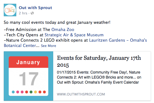
Much of our recurring traffic comes from social media2. To foster this flow of traffic, we post our sites’ daily event pages to Facebook and Twitter on a regular basis.
The web in general — and social media in particular — is a fight for attention. What makes it worse is that people don’t read words. What they do do3 is look at pictures. Disagree with that? Just ask Instagram or Pinterest about it.
Social media posts that include imagery out-perform posts that don’t. Any Social Media Guru worth her weight in Likes will tell you that. Because of this, we include our site’s logo with each post. (Posts promoting specific events often have better images that we use, but our logo is the fallback.)

An image of our logo is better than nothing. It makes our posts immediatey recognizable, but it’s also boring. In a zero-sum fight for attention, boring loses every time. What can we do to improve our reach?
The Solution
Each day’s events are unique. If we could somehow reflect that uniqueness in the imagery that gets posted to social media, then we would have de facto fresh image content each day4.
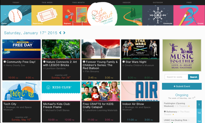
Enter our art-directed, data-driven image files. Check out the day view for Saturday, January 17th.
http://www.outwithsprout.com/2015/01/17
You will notice:
- 3 Explore events (highlighted in red)
- 1 Experience event (yellow highlighted in yellow)
- 1 Play event (highlighted in green)
- 2 Create events (highlighted in pink)
- 1 Cheer event (highlighted in blue)
Now, append a .png to the end of that URL:
http://www.outwithsprout.com/2015/01/17.png
You get this instead:
Pretty cool, right? Not only is the day’s date presented in a little calendar widget, but each event for that day is represented by a color-coordinated circle. It’s a subtle-but-unique way to re-enforce how color plays a role in our sites’ content.
Next, check out the 18th:
There are only 3 events on the 18th. Hence, 3 colored circles on its image. Each image is generated on request and represents the current state of our database of events. We use these images in place of our logo on social media.

How We Pull it Off
There’s an awesome gem called IMGKit — which wraps wkhtmltoimage — that we use to pull this all off. The gem takes our authored HTML and converts it in to an image.
Rails is designed to handle alternate MIME types — via the respond_to API — really well. We already have a controller action that fetches the day’s events, so all we have to do is tell it to respond to png requests:
respond_to do |format|
  format.html
  format.png do
    kit = IMGKit.new render_to_string, width: 300, height: 300
    send_data kit.to_png, type: "image/png", disposition: "inline"
  end
end
Requests for html will render the app/views/events/day.html.erb view, just like always. Requests for png will render the app/views/events/day.png.erb view. Now we add a view that includes the HTML to be converted in to the image and we’re done!
Here’s the guts of the view (sans CSS):
<body class="<%= Omahype.theme %>">
  <div class="calendar">
    <h1 class="calendar-month"><%= day.to_s :month %></h1>
    <h2 class="calendar-day"><%= day.to_s :day_number %></h2>
    <ul class="event-dots">
      <% day.events.each do |event| %>
        <li class="<%= event.event_classes %>"></li>
      <% end %>
    </li>
  </div>
</body>
Pretty simple, huh? One thing to note: you cannot easily reference external style sheets from your image views. We inline everything in a style tag to get around this limitation.
Finally, we point the social medias at this new .png URL so they grab it instead of the logo image. Here’s the meta tags generated to handle this:
<meta property="og:image" content="http://www.outwithsprout.com/2015/01/17.png" />
<meta property="og:image" content="http://ows-production.s3.amazonaws.com/assets/ows/fb-og-8eb228bfcc6eebb2397df92c5ccf3b3d.png" />
<meta property="twitter:image:src" content="http://www.outwithsprout.com/2015/01/17.png" />
Why two og:image tags, you wonder? Because Facebook will accept a cascade of images and use the first (or best) one by default. We want to use our custom day view image, but if something goes wrong we fall back to our logo image instead.
Caching
Generating these images isn’t the fastest process in the world. It generally takes between 500ms and 1800ms per request. We don’t need them to be up-to-the-moment fresh, so we add a cache and only regenerate them once every 24 hours. This is just a single line of code added to the respond_to block:
format.png do
  expires_in 24.hours, public: true
  kit = IMGKit.new render_to_string, width: 612, height: 612
  send_data kit.to_png, type: "image/png", disposition: "inline"
end
Other Uses
Once we went through all the work of setting up the dynamic images, we started to think of other ways we could reuse them. Our newsletter lists the upcoming week’s events day-by-day, so that was a natural fit. We link the day images in to it via a good ole’ img tag. No extra coding necessary!
Caching plays a huge role in this use case because each person that opens the email will hit our server for five day images.
We’ve been experimenting with another use for these images which could be awesome (especially for Omahype).
We could just as easily design a custom event image. It would frame in the event’s artwork and overlay it with date/time/location info. Then these event images could be made available for download so others can use them to promote the event.
We made a few steps down that road, but haven’t fully fleshed the idea out yet.
All The Small Things
This is a minor feature that many people will never even notice. Why all the fuss? Because it’s small details like these that surprise and delight people.
If your website has unique and interesting content, I’m sure you can come up with some rad uses for art-directed, data-driven image files. It’ll set you apart from the crowd.
-
The beauty of side projects — especially those with active users — is that you can use them as playgrounds for trying out new things. ↩︎
-
A fact that I loathe. We’re trying to break free of Facebook’s shackles with a newsletter. So far that strategy is working just OK. ↩︎
-
Snicker at this and you’re as juvenile as I am. ↩︎
-
Cody gets full credit for this idea. I just made it happen. ↩︎


